Tuesday, 13 October 2009

College Magazine Montage And Inspiration


My first design for the layout of the magazine. It's plain and revolves around the text. However I have redesigned it and came up with something that is with more colour and more to do with the design of the text along with the picture.


The font styles I decided to use were inspired by the cover of 'The Eye' because the masthead and cover lines to the selling lines were all different. They grabbed the readers attention and I intend to do the same with using these styles.

Friday, 2 October 2009


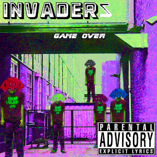
The names for the songs I had chosen via thinking on the lines of games, seeing as my band is called Invaders. I went onto Dafont.com to find the seperate fonts which would best suit the names and pasted them onto photoshop before adding to the image. The Space Invaders images are a logo of sorts for the band, to be an enticement like the image of the actual members would be. The hardest thing I've had to do on this project would have to be deciding what type of genre of music I was working with then going on to edit the images to fit it. Fortunately I messed around a little with the images then managed to come up with an alternative techno band.

At the beginning of the project, I had intended to conform to a more Emoish band but had gone on toward a techo alternative band and worked on it from there. The various figures on the cover were intended to be the band members but by duplicating the images and adding a Space Invaders image for the heads, I was able to create a sort of gaming surreal cover; thus conforming to the techno side of the split genre and getting the album name. Game Over. This also added to the target audience I have aimed it at, teenagers who like the techno side of music as well as the gaming industry.