Thursday, 19 November 2009
Tuesday, 17 November 2009
Thursday, 5 November 2009
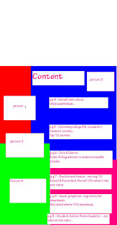
Contents Page Of School Magazine - The Finished Design

I am pleased to find that the finished design has come out just as I had expected; able to follow the plan and develop it with more detail whilst keeping to a simple layout. I followed the idea of bright colours, using a tiled background to help make the text stand out. I chose the texts in black and white to stand out compared to the others, used as 'catch-phrases' to get the reader's attention.
College Magazine Cover - Final Design

The cover of my magazine idea. I used The Eye as inspiration on the design of my magazine, using the bright colours of the background to contrast with the text so it can stand out more. However, I used my own knowledge of what students are more likely to read and used it to design the format. At first I was going to stick with the same text for the cover lines, however I changed it once I realised it would look boring and not eye catching. I am pleased that I didn't have to alter my idea too much, using bright colours as a basis and working from there. The target audience is generally the studen population, from the first years to the last, with the interest of music being the compound of the magazine, with other ideas that would interest a teenager and young adult.
Tuesday, 3 November 2009
Subscribe to:
Comments (Atom)
